Food Truck
Delivery App
Actually a lot of food trucks use social media to post where and when they are and a menu, everything is not fast and easy to use, specially where big app like just eat are not serving the area.
The goal of this project was to design a mobile app for a food truck with delivery and take away service.
UX/UI Designer.
Conducting interviews, paper and digital wireframing, low and high-fidelity prototyping, conducting usability studies, accounting for accessibility, and iterating on designs.
USER
RESEARCH
SUMMARY
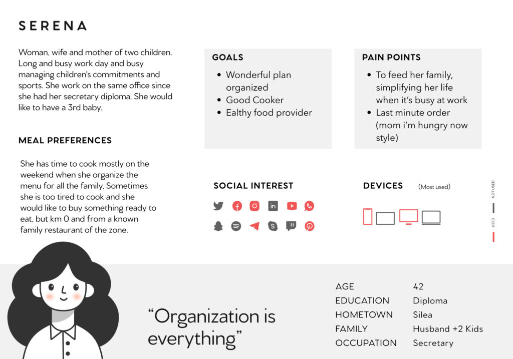
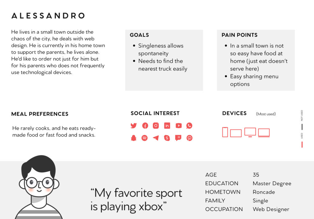
By my project I’d like to identify frustrations people experience during the process of ordering from a restaurant or a food truck in a small town where for example you can’t use just eat or similar apps.
- PAINT POINTS
- The current ordering process involves a lot of manual input from both the business owner and the customers themselves
- Customers don’t like the current process of making an order via Whatsapp or Facebook.
- The locator of trucks wasn’t clear and easy, it was published on social media by images.Customers want to know when the food truck is or will be coming to their neighborhood.
- The payment process currently cannot be done online. Customers pay directly at the food truck
I conducted interviews and created empathy maps to understand the users I’m designing for and their needs. A primary user group identified through research was a balanced mix of people with different needs and technology abilities. Usability test based on time on task, conversion rates and SUS.
PERSONAS &
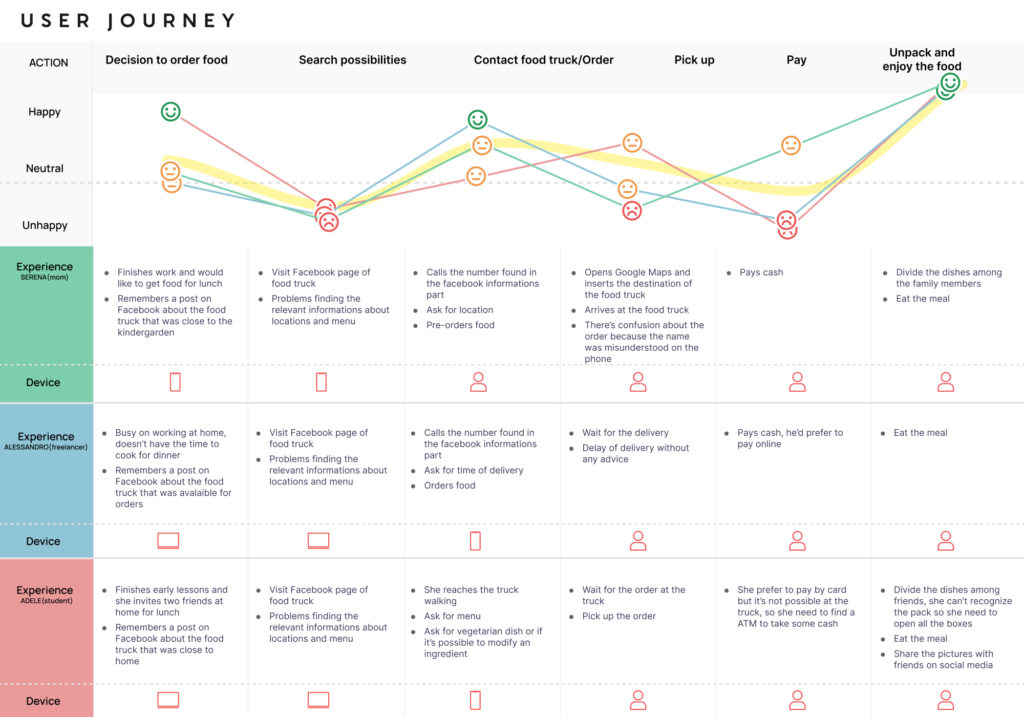
USER JOURNEY
The quality of food is covered from the slow and complicated journey to reach it in all the phases.
WIREFRAMES
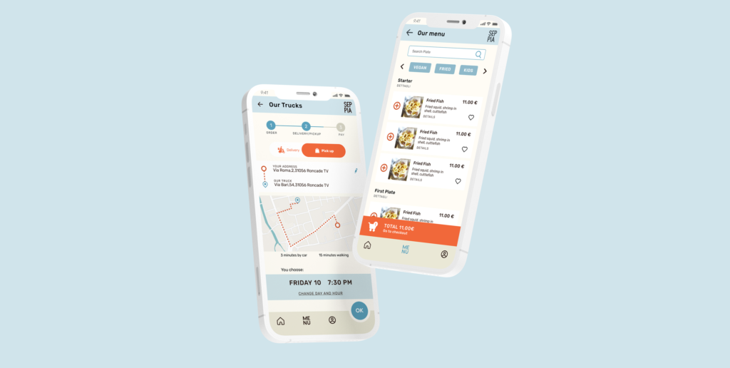
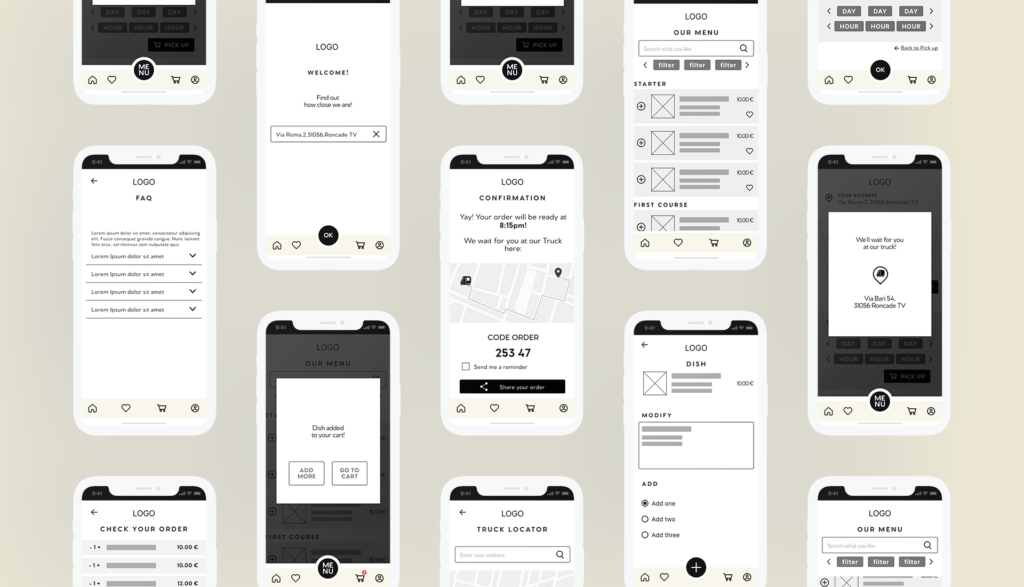
On paper wireframes the delivery and pick up choice was at the beginning of the project, after user research was splitted in two screens.
HI-FIDELITY
On paper wireframes the delivery and pick up choice was at the beginning of the project, after user research was splitted in two screens.
CONCLUSIONS
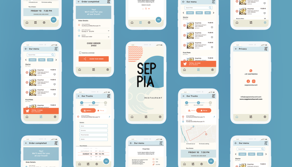
Color was tested to respect accessibility standards, language choice to allow everyone to use the app, alerts and detailed infos for allergies and filter to make easy the choice of plates
“Easy to use”
“It allows to see where the truck is also if i want to order for another day”
“Clean and easy”
Add visual details, continuing studying other competitor to understand pain points
